
Cluttons
Bringing a fresh new perspective to property.
Helping Cluttons compete with the big four.
Cluttons is an independent, full-service property consultancy with a high-end residential estate agency arm.
Over the past decade, as their brand partner we’ve modernised the Cluttons brand identity. Building on the success of our work in 2014, we’ve recently sharpened the firm’s market position to help deliver on their new five-year business strategy.
What we delivered
– Leadership workshops
– Brand positioning
– Brand identity
– Brand guidelines
– Website
Challenging convention with a defining proposition
The professional services industry is built on tradition. As one of the UK’s longest established firms, Cluttons could easily play in this space, but instead chose to reflect their pioneering spirit and celebrate their progressiveness.
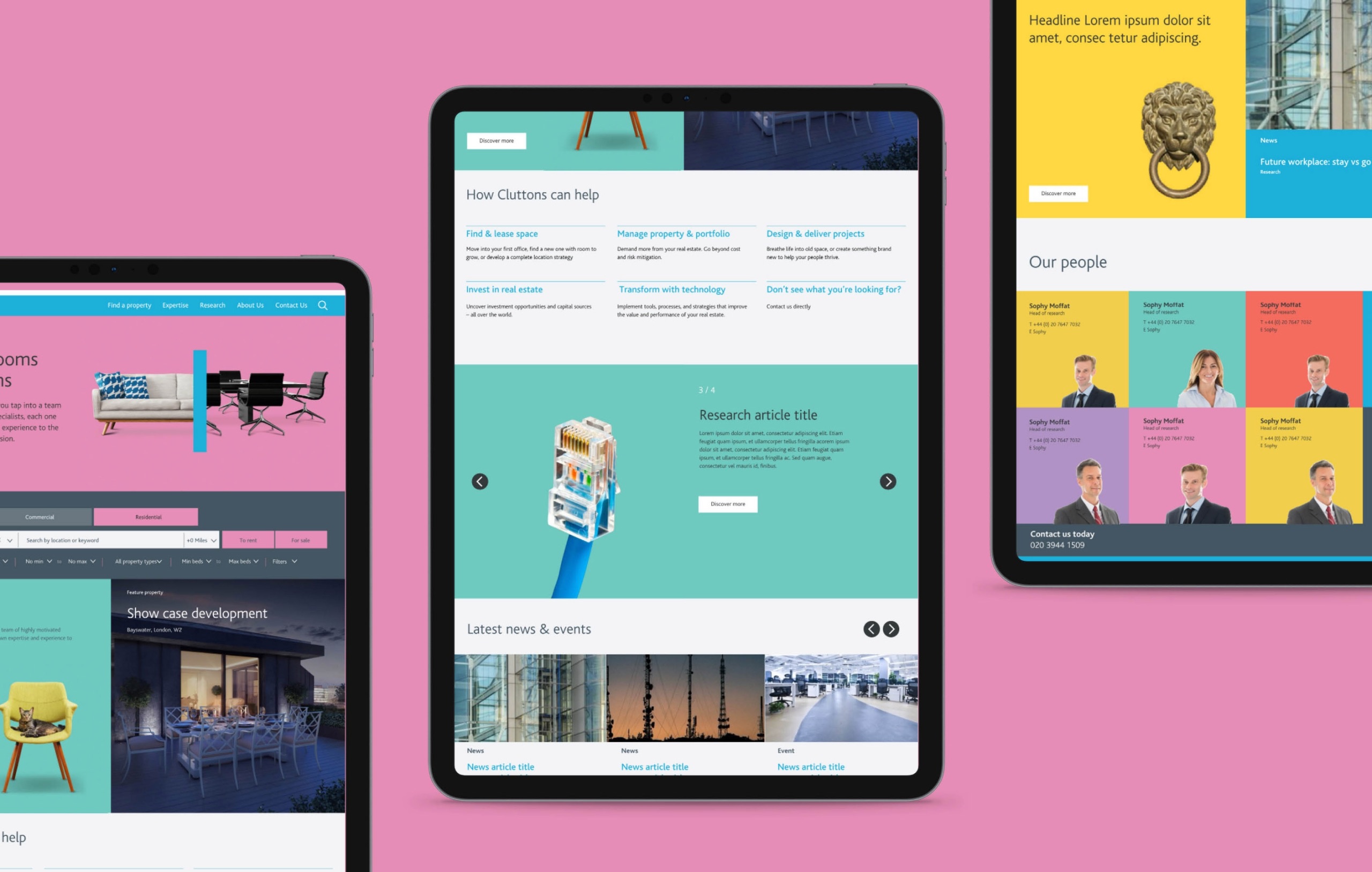
Drawing on its multi-disciplinary capability, Cluttons identified an opportunity to deliver a more holistic service to larger commercial clients, supporting them through the property lifecycle. This industry-leading idea was captured in the proposition: make more of your property with Cluttons, setting the scene to tell the whole story.

Balancing continuity and change
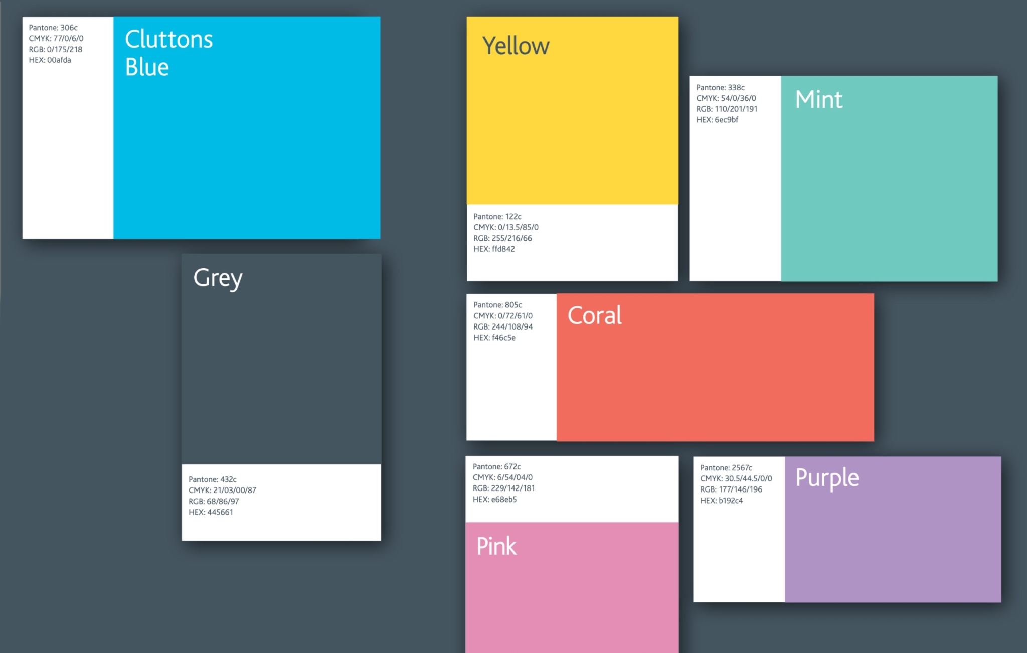
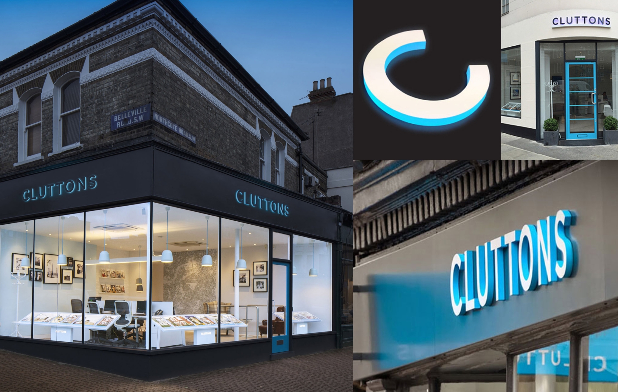
The understated logotype, Bliss font and core cyan blue were retained to provide a point of continuity for the brand.
Everything else changed.
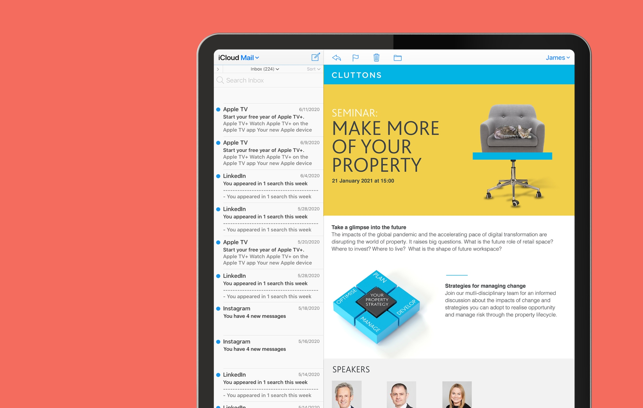
A bright secondary colour palette was introduced to inject a greater sense of creativity, energy and vibrancy to the brand.
Breaking from the clichéd use of library imagery most competitors use, cutout photography was juxtaposed with bright colour backgrounds.
A new infographic style supports a research-led leadership programme
To bring complex concepts to life and illustrate how value can be derived through the property cycle, we developed an isometric infographic style.
This was applied to Cluttons property sector research reports in key sectors such as infrastructure and telecommunications. The result not only demonstrated of Cluttons’ expert thought leadership, but reflected their contemporary, progressive nature.


Adding character to the residential side of the business
To create standout and personality for the residential estate agency side of the business, we introduced the peacock as a brand mnemonic. This characterful bird combines a sense of prestige, awareness and pride, with a touch of playful expressiveness.
The peacock is now used across all the residential team’s marketing, from advertising on the property portals to in-branch displays, creating strong brand recognition and a consistent visual cue.