Rapleys
Taking advantage of agility to outperform size and might
We helped Rapleys go head-to-head with industry giants with a bold challenger brand proposition.
Rapleys is a mid-tier property consultancy, unusual for its size in offering a full range of property services with a national footprint. With increasing consolidation in the market, larger players were using their scale to win market share and seize the more lucrative, larger instructions. To add to the threat, a number of Rapleys direct competitors had undergone a recent rebrand, giving these competitors a more prominent position in the market. Rapleys had to take action. Under the leadership of a new management team, Rapleys took the business through a strategic reorganisation and identified branding as a strategic priority.
What we delivered
– Leadership strategy sessions
– Brand positioning
– Brand identity
– Brand guidelines
A David versus Goliath advantage
Working closely with the leadership team, Industry uncovered a clear point of differentiation that formed the foundation of a winning brand strategy. Unlike mid-size competitors, Rapleys’ national footprint and broad service offering meant Rapleys had the potential to go head-to-head with the larger players. Its people are experienced, with in-depth knowledge in key and niche industries, and do not have to go up the chain of command to await decisions, the latter a clear pain point for many clients. By contrast, Rapleys could get ahead and get the job done brilliantly, and without delay. Rapleys’ David versus Goliath advantage was its ability to be more agile and respond to client briefs more quickly and more efficiently. This advantage was encapsulated in the brand essence: Rapleys. Get it done.


Creating the confidence to win
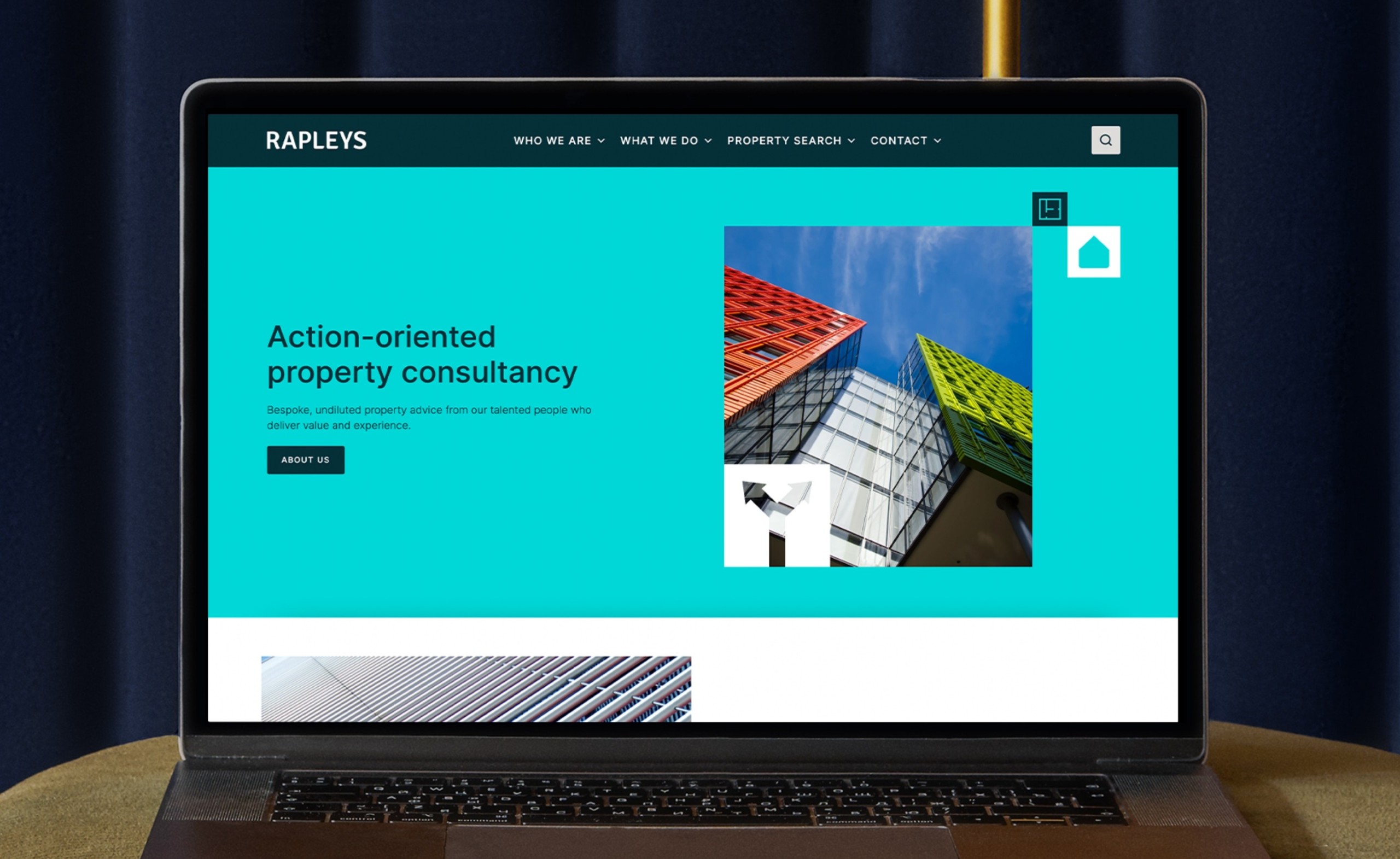
Building on the new strategic positioning, the bright new brand identity was designed to give the firm greater profile and project the confidence of a modern, top-tier property consultancy while being unashamedly and authentically Rapleys in its size, delivery and approach. The well-crafted logotype was retained but the visual clutter surrounding the logo was stripped back, giving it more air and authority.

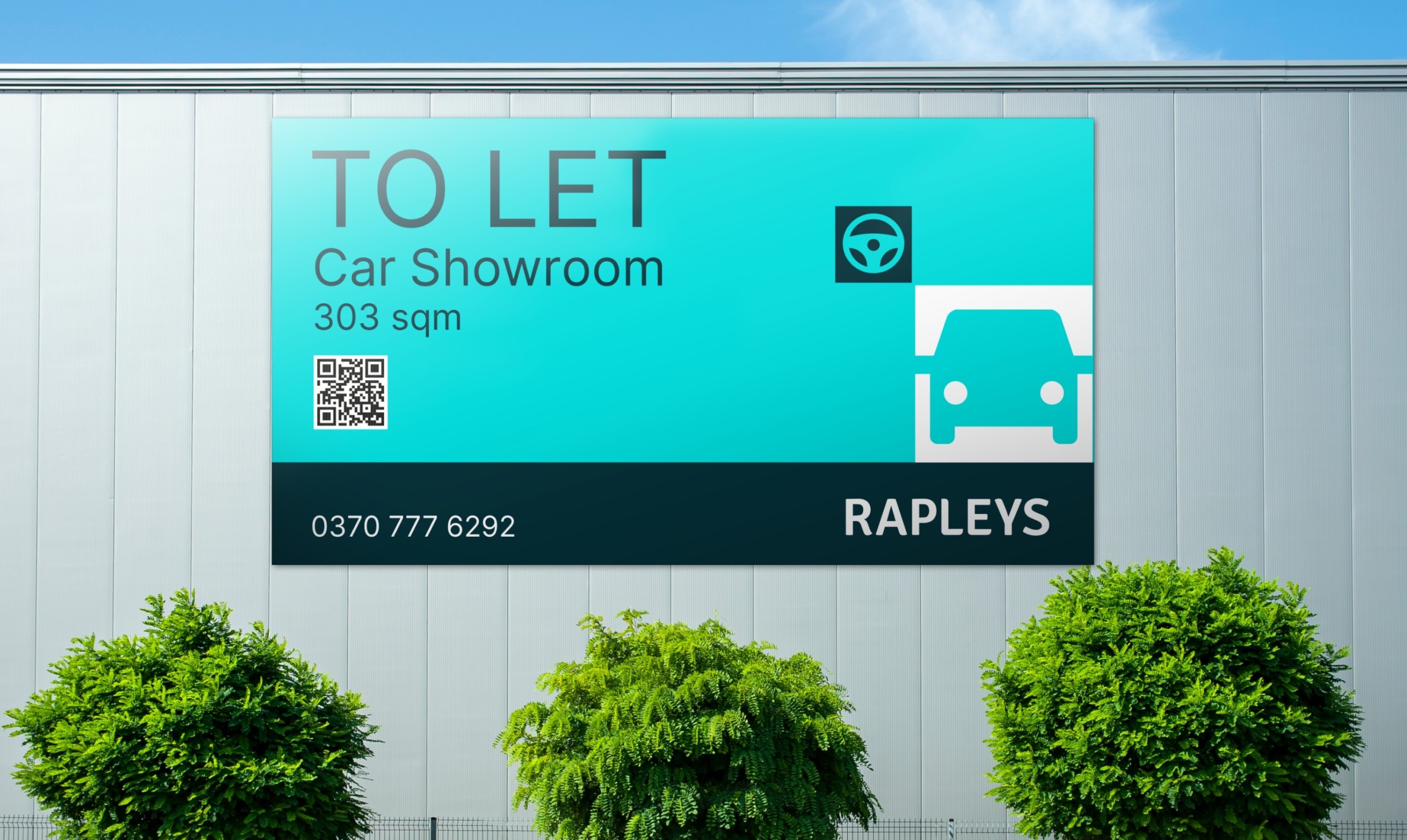
Bringing to life a clear market focus
A vibrant colour palette and icon-style graphics allow Rapleys to signpost the markets they serve, and the range of services they offer. The icon graphics are offset with bold, graphic photography that conveys a sense of scale and sophistication.


Results
Despite the tough economic climate that has particularly impacted the property sector, Rapleys is going from strength-to-strength, with growth across its four core markets.
Following the rebrand, Rapleys has announced record results for the year ending April 2023 with turnover of £16.02m, compared to £12.8m last year, a rise of 25%, and a pre-tax profit ratio of over 30%.
The new brand has also helped Rapleys to attract and retain high calibre new staff so vital to its growth. The business has been shortlisted for ‘Employer of the Year’ in the Building Awards.