Chemistry Europe
Strengthening bonds to catalyse growth
Repositioning a portfolio of Chemistry Journals for Wiley-VCH
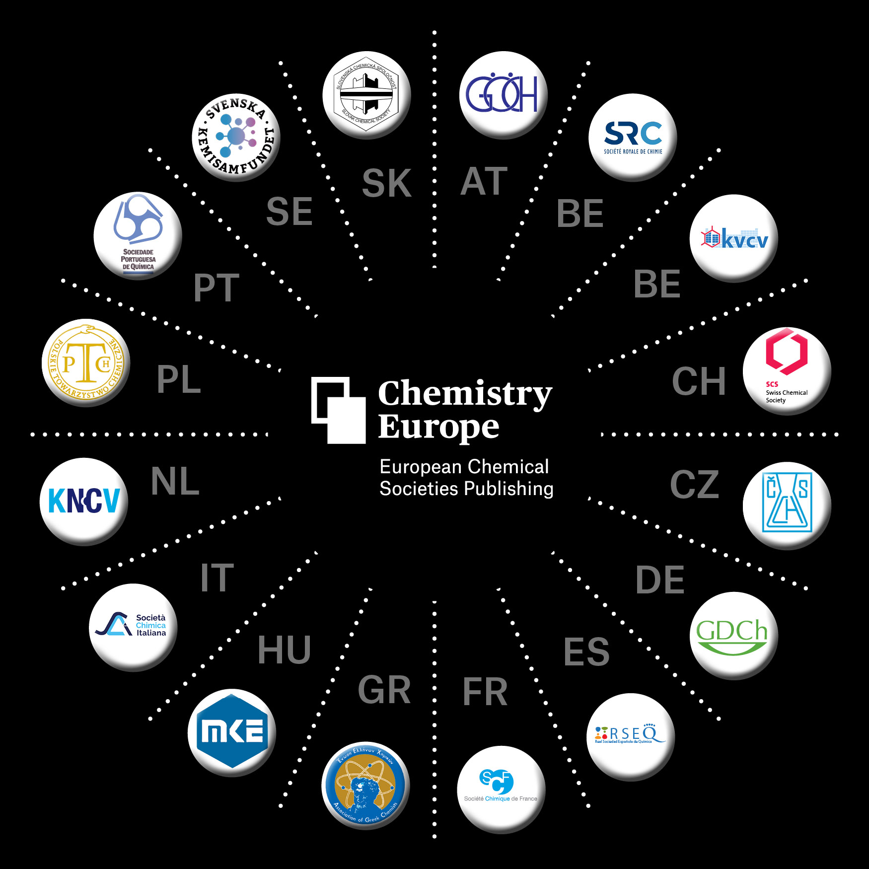
Comprising 16 chemical societies across 15 European countries and representing over 75,000 chemists, Chemistry Europe (previously named ChemPubSoc Europe) is a global leader in chemistry research.
Their extensive portfolio of scientific journals, published by Wiley-VCH, faces fierce competition from the prestigious American and UK Chemical Societies.
Industry worked with the team at Wiley to develop a new brand for Chemistry Europe and its journals, to help elevate its reputation for scientific excellence and support its mission of bringing ground-breaking research to a global audience.
What we delivered
– End-user research
– Brand positioning
– Naming
– Brand identity
– CX
– Journal design
– Illustration
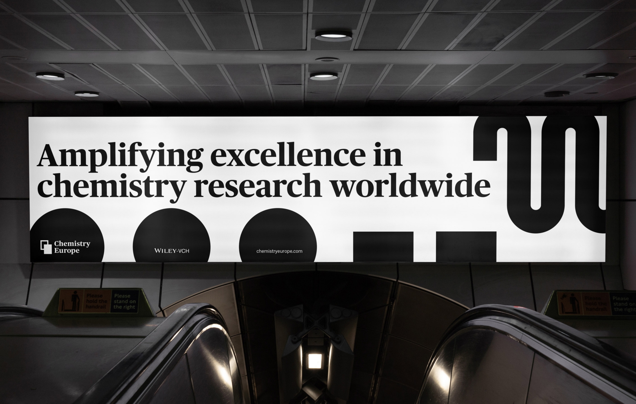

Building on a legacy
Europe has a long heritage as the home of chemistry research, giving our client a distinctive edge on their competitors. Market research confirmed their potential to serve as a gateway between the global research community and the pioneering work of Europe’s highly respected community of chemists and scientists.
This insight formed the cornerstone of the brand strategy, leading to a positioning anchored in the bold and confident name change from ChemPubSoc Europe, to Chemistry Europe.
Standing out in an outstanding field
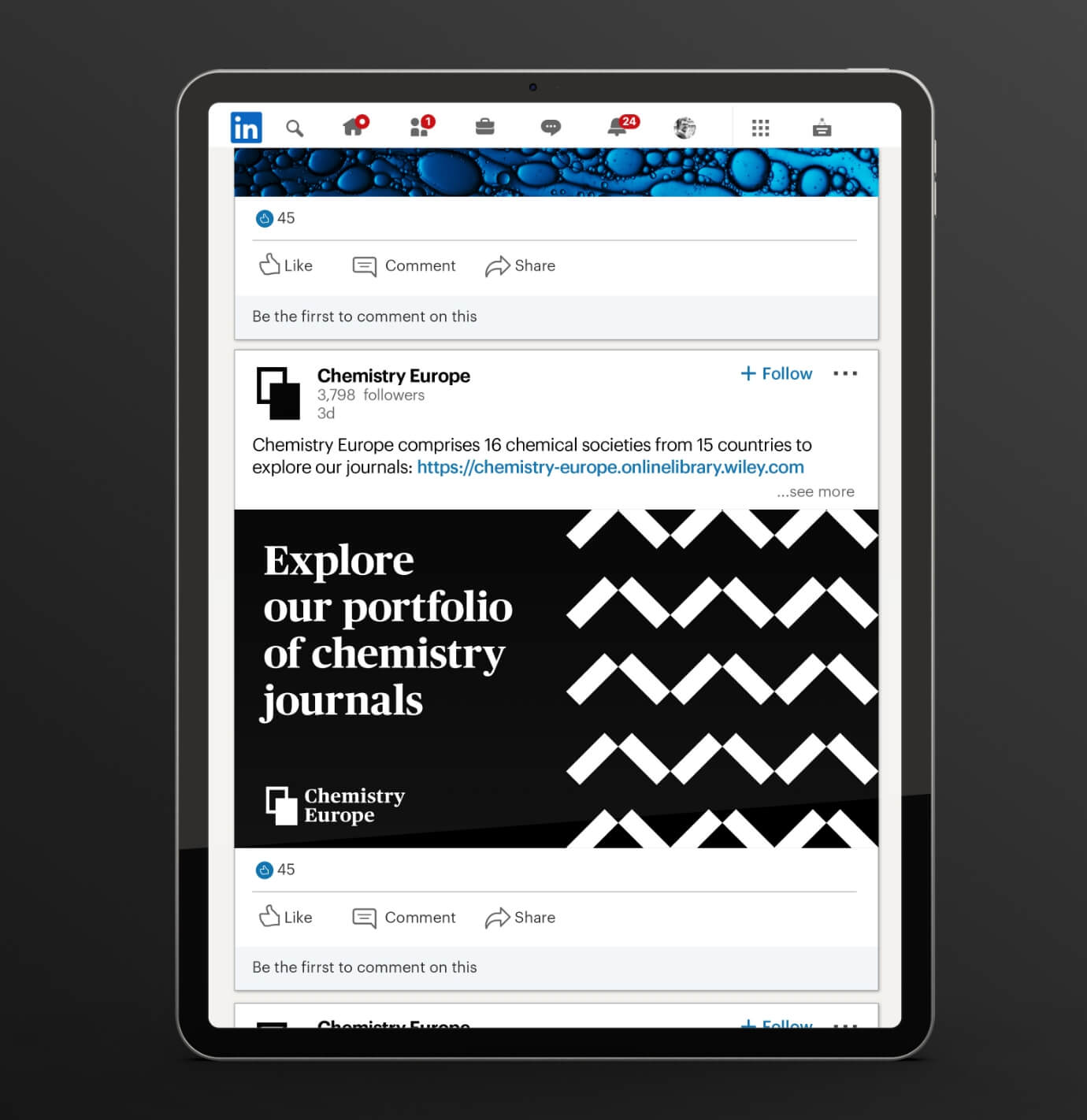
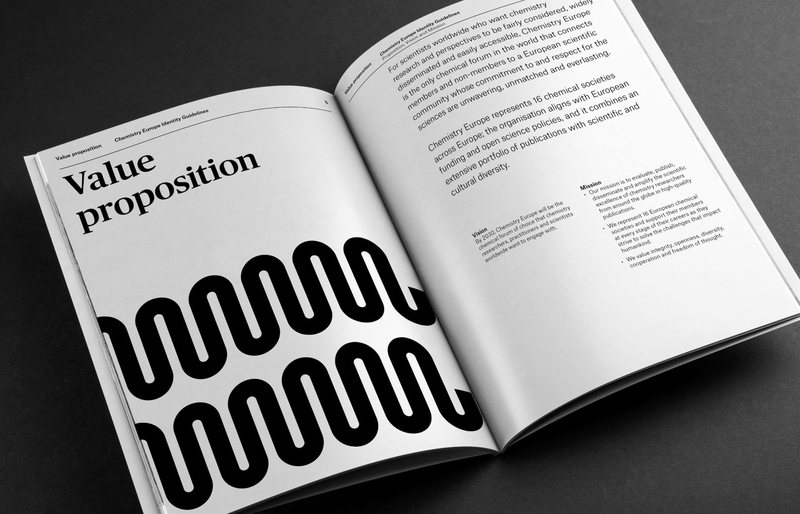
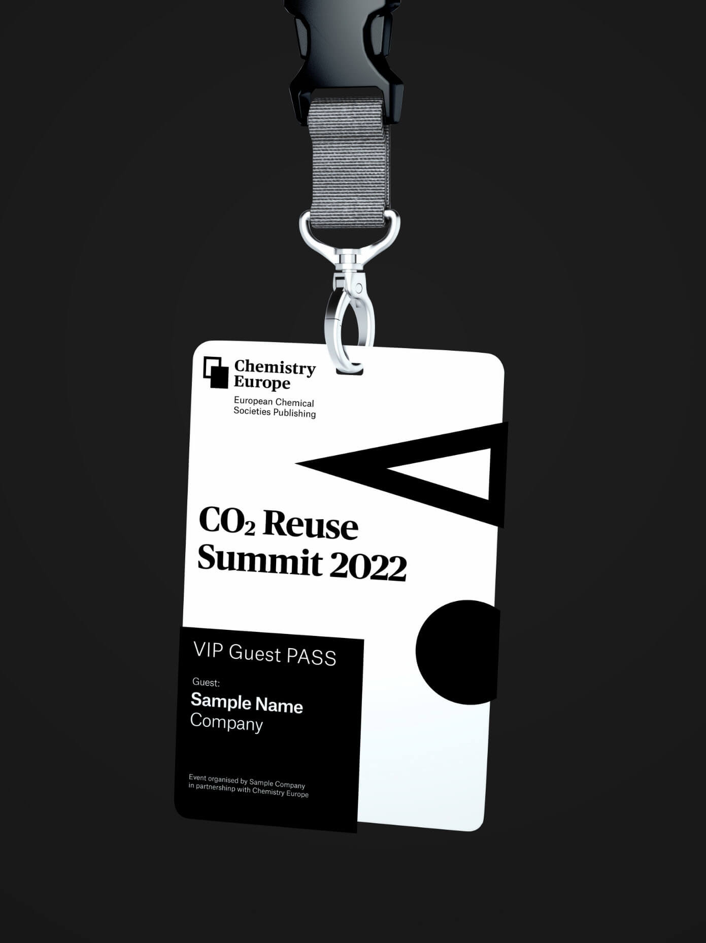
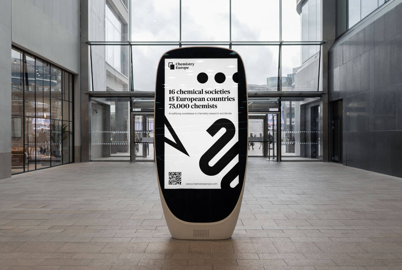
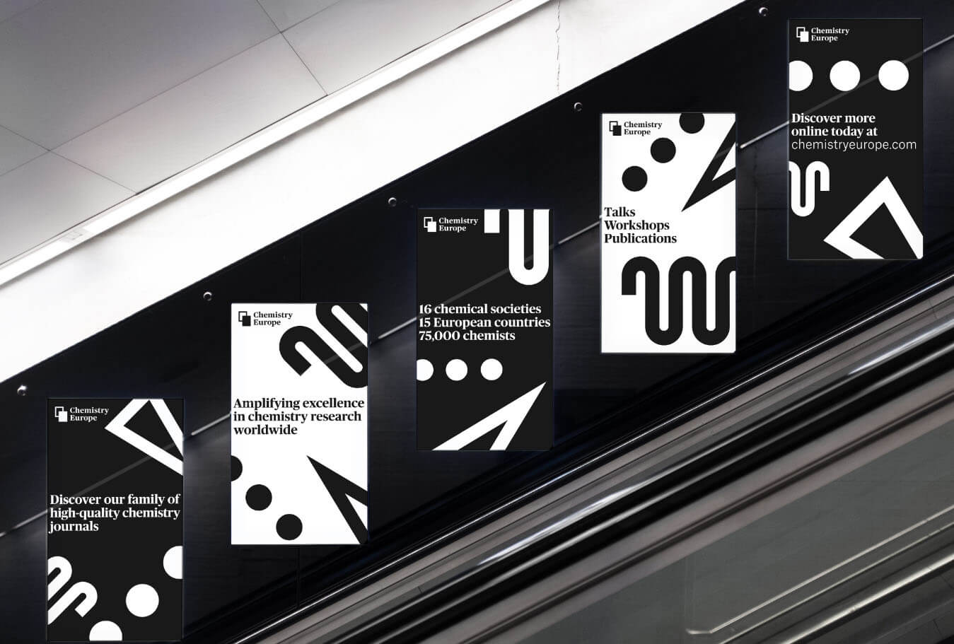
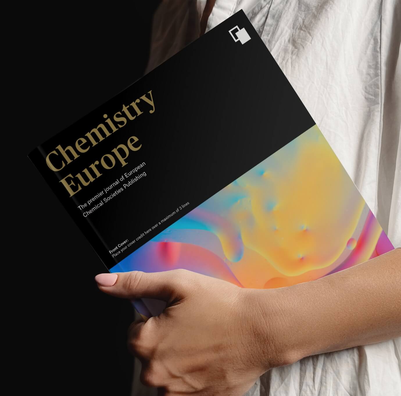
Colours are used prolifically in the world of chemistry publications. We achieved stand-out by focusing on a distinctive black-and-white palette. This, together with the abstract illustration style drawing on chemical symbolism, elevated the visual appeal, delivering a more premium and distinctive product.
Creating a family of journals
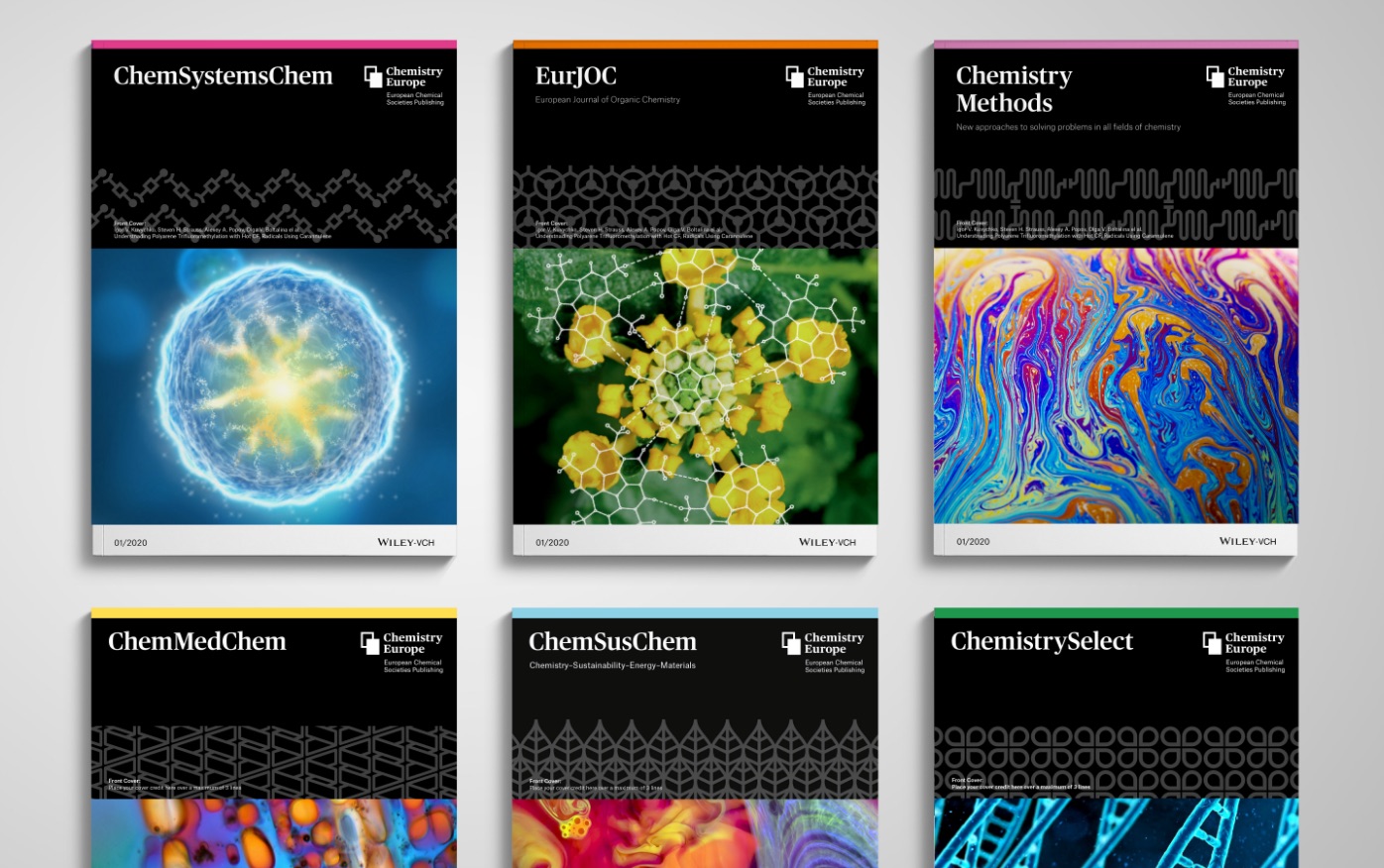
We brought the portfolio of 15 journals together under the Chemistry Europe brand, using a shared design system. For the masthead of each publication, we created a pattern based on a unique symbol relating to its subject matter.
Visual expressions of bonds and connectivity are a recurring theme across titles, serving as a metaphor for the way the publication connects the research community.
Putting the user experience at the heart of the brand
Undertaking user research, we identified critical touchpoints by benchmarking key moments in the publishing journey, from article submission and peer review, to publication.
The resulting analysis informed the design of a user experience that supported the mission, making publishing in the journal more attractive to researchers.
The rebrand delivered tangible results
With a tangible increase in article views and full-text downloads (FTDs) from the journals, the rebrand is helping Chemistry Europe deliver on its mission.
Just one title alone, Chemistry, A European Journal, saw full-text downloads increase 22% following the rebrand, putting the brand in front of more scientists, and as a result, boosting its profile in the wider research community.