“We make fonts. People still make fonts” has become something of a mantra throughout my career as a type designer. Only now when I say it today, as an Executive Creative Director at Monotype, and 22 years into my career in the age of AI, it has a different meaning. For AI’s biggest players, fonts are low on the priority list but look deeper, and humming below the hustle in dark mode GitHub, there are folks thinking about how to translate the DNA of a typeface into a learned font-vector making machine. They seek to take what took us years to master and compile it down into a slick algorithm. Of course, we keep calm and carry on…
AI or AT (artificial typography) is an area that has been with us for a very long time, and it is often celebrated in Monotype’s annual Type Trends Report, a curated inspirational gift for the creative community. We started making these reports back in 2019, and the scale, and size of each campaign grows in numbers, the marketing stats are wild. And they should be, no matter how dead these trends are when they are published, they are also an opportunity to immerse yourself in the passionate world of typography today, to reflect and speculate on where things in our graphic culture are heading. AI will likely be a ‘thing’ for quite some time, and just simmering below AT is a world of deep immersive metadata. Specifically, the metaverse – a slow-moving evergreen technology with the long-term investment of some of the world’s rich list in data.
How did we get here, typographically? The Chinese invented movable type blocks. Johan Gutenberg re-launched it in Europe with huge entrepreneurial success. Typewriters emerged and then the Monotype Super-Compositor emerged. Then came photo-type and Letraset. Before we knew it, microchips began doing and thinking. You know this, but every step of the way, the shape and form of letters changed. Typefaces adapted to meet the needs of the machines and naturally, the machines have morphed into a wearable interface of modern-day opportunity – Vision Pro etc… And like everything else that came to pass, wearables will influence the role, the look and feel of letter shapes too.
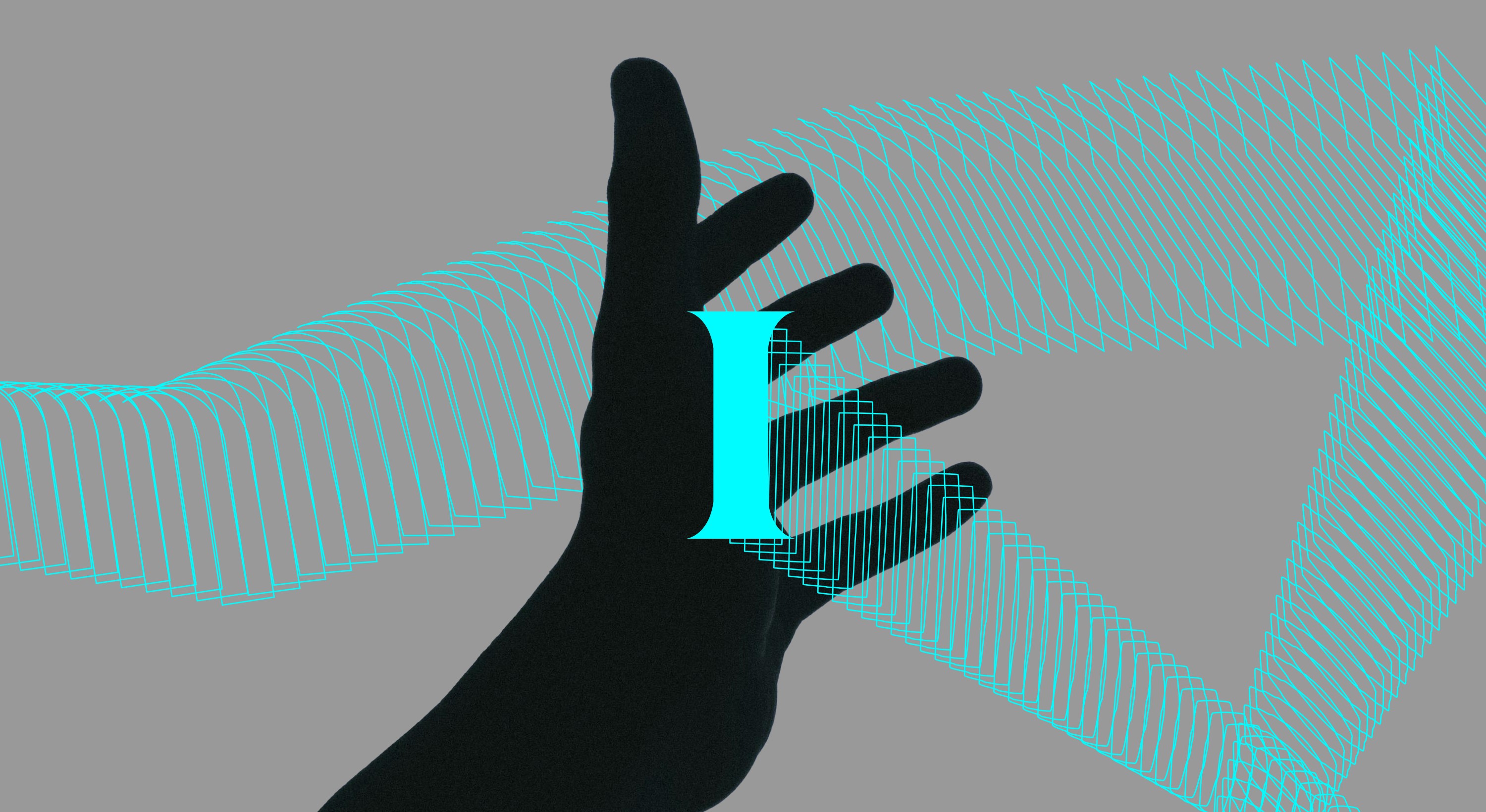
Fonts are complex software that contain all kinds of data on glyph shape, kerning, metrics, hinting, naming, features etc… It goes on and on. This is why we license fonts as software. Behind every font is a team of designers and engineers solving for the future form of language. Formal and digital typographic innovation is critical to relevance. If you are not exploring the multi-dimensional form of type, you probably should be. The new typographic dimension is the coming wave of typographic revolution. Typographic movement, adaptation and interaction will be the differentiator that enables unchartered digital experiences for brands. Typefaces will be dialed into your person profile, your lighting, the angle of your head and likely your emotional state. Reality is fluid and so, typography should express a fluid reality. New ideas need new letterforms. And with the shape of words, we want to make our world a better place to live in.
The act of checking out creativity and typefaces changes us. It cues us into the ways our fellow designers are acting and choosing type to speak with. The act of looking has an effect, it’s impossible to not influence your taste making subconscious. Geometric-humanist typefaces have become an unending, boring, zeitgeist in digital design. Blanding is probably the most dangerous typographic trend. The digital experience is reading, and words are an opportunity to truly differentiate, to own a message. So much typography is similar today, and we live at a time when there is a poverty of attention. Make new meaningful typographic experiences for your audience. Something to consider – an old typeface in a new time, and with a new message, can be a new typeface again.
95% of UI design is simply good typography, and so what can typography bring to the function of new devices? Yoon Park’s experiments have been leading the way at Meta, his type moves as we move, his work implies the future navigation of cities with a headset, how instructional type will assist us to do physical tasks, like cooking a meal or fixing your car’s engine. The typography of the future will be hyper-functional and instructional in our virtual playing fields.
One 8th of the world’s population lives with a visual impairment. Imagine a world where your audience or market will grow with personalised reading experiences. We believe that catering for individual accessibility will demand a bespoke typography, one that empathises with us as individuals, type that connects to our felt experience. Fonts are transforming to give the sense of being a live interface.
Today’s typographic form follows feelings. Brian Collin’s recently doubled down on this idea by declaring that form follows fantasy. As our clients begin building new virtual worlds, there should also be an opportunity to choose more diverse typography, to create a richer, free and expanded reality filled with unique voices. One day we may walk around our favourite books and feel those stories in unexpected ways.
The value of typography is being pushed into the mainstream and slow but pertinent feed of the metaverse is moving onwards whilst our gaze is elsewhere. We are but a small step away from generative typographic worlds. Our thirst for new experiences and longing to uncover new forms is why we keep on making typefaces. Form follows the future. An unknown place where the fearless-type-meta-mavericks can take us.
Phil Garnham
Phil is an Executive Creative Director with many years of experience in the design and engineering of fonts for global brands. He collaborates with design studios to create alphabets of all shapes and styles. Phil has worked on numerous high-profile projects at Montoype, including custom type for Evri and O2.
