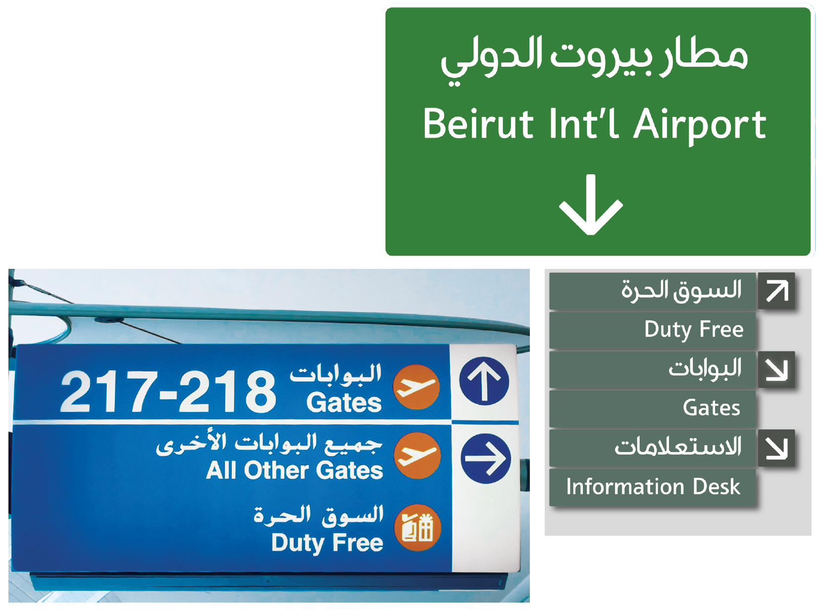
The 21st century has seen undeniable growth in awareness of Arab cultures, presenting designers from all over the world with the challenge of working with both Latin and Arabic typography. This has driven demand for sympathetic letterforms that have an inherent visual harmony. Designing with Arabic can yield innovative, beautiful and successful results, but non-Arabic-speaking designers need to appreciate the evolution of Arabic typography and understand and respect the cultural nuances of the language.
There are fundamental differences between the two scripts: Latin is written from left to right whereas Arabic is written from right to left. Latin has both upper and lower cases, both of which can be italicised. Arabic has no upper case letters and if not designed and executed properly, italics look as if they have been skewed.
Where Latin font design is based on the notion of a set of baselines from which heights of ascenders and descenders are established, Arabic font design is based on a complex system of measurements per basic letter shape. Letters hardly ever sit on the same baseline and their ascenders and descenders are of various lengths.
Any Latin typeface, be it classical or modern, will tend to be discordant when used with an Arabic typeface, simply because they were not designed to work together. Some Arabic and Latin fonts are more compatible than others, but none of them pass the test of the visual relationship between the heights of the letters, the weights of the strokes or the overall calligraphic appeal.
Designing a workable bilingual Latin–Arabic typeface relies not upon compromise but rather a harmonious interaction between two distinct elements, each with an underlying cultural history.
The Arabic language is used in 23 countries and is spoken by nearly 300 million people. The script that is widely used today can be traced back to the Nabataean Kingdom’s writing script of the second century BCE, which was itself descended from the Aramaic alphabet.
For centuries, the pre-Islamic peoples of the Arabian Peninsula enjoyed an essentially oral poetic tradition. The written word was largely unimportant. All of this changed with the Divine Revelation in 632 CE which created the need to record every word of the Holy Qur’an in exact detail. Heroic feats of memory could no longer be relied upon. The Arab fascination with the beauty of the spoken word, coupled with the limitations of existing Arabic scripts, played a positive role in the development of Arabic calligraphy as an art form.
In a relatively short time, Arabic script was transformed and beautified, worthy of its status as the sacred script. The ability to create Arabic typefaces capable of being relevant in today’s marketplace, without sacrificing the essence of the language, remains a huge challenge. Type can generate a high level of brand recognition and provide identification with the company, both internally and externally, so companies who are serious about growing their brand in the region need to make their identity work in both languages and cultures.
